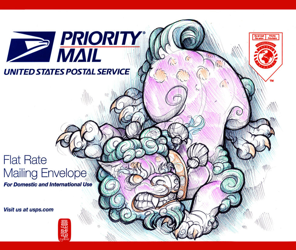
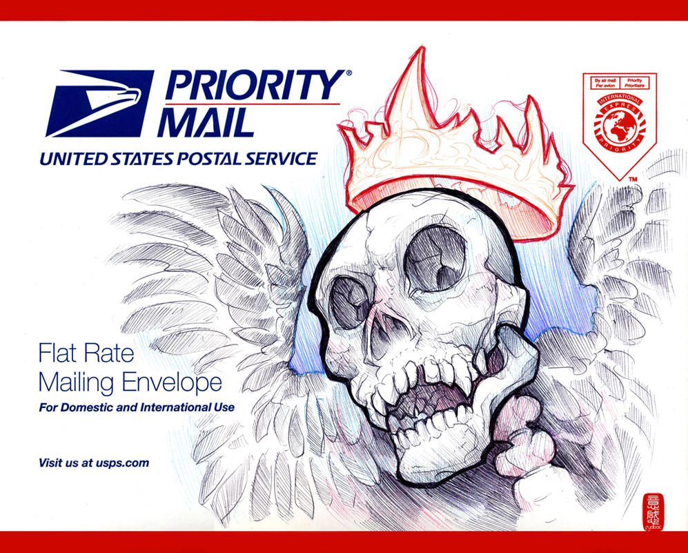
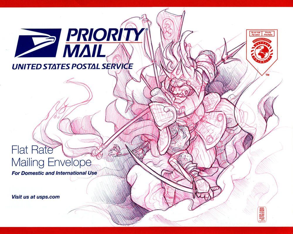
Monday 28 June 2010

youve got mail

when i was young the act of receiving something in the mail was met with excitement and optimism, now as i grow older its becoming more of a chore when most mornings im met with bank statements and bills, but an artist and illustrator by the name jainai jeffries has started a fight back against the monotony of collecting your morning post with these beautiful creations.


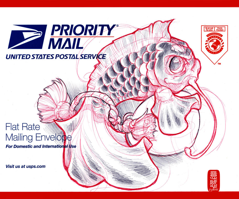
each one hand drawn and lovingly created in incredible detail to bring something special back into receiving mail.


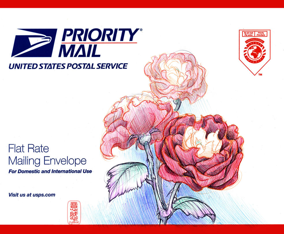
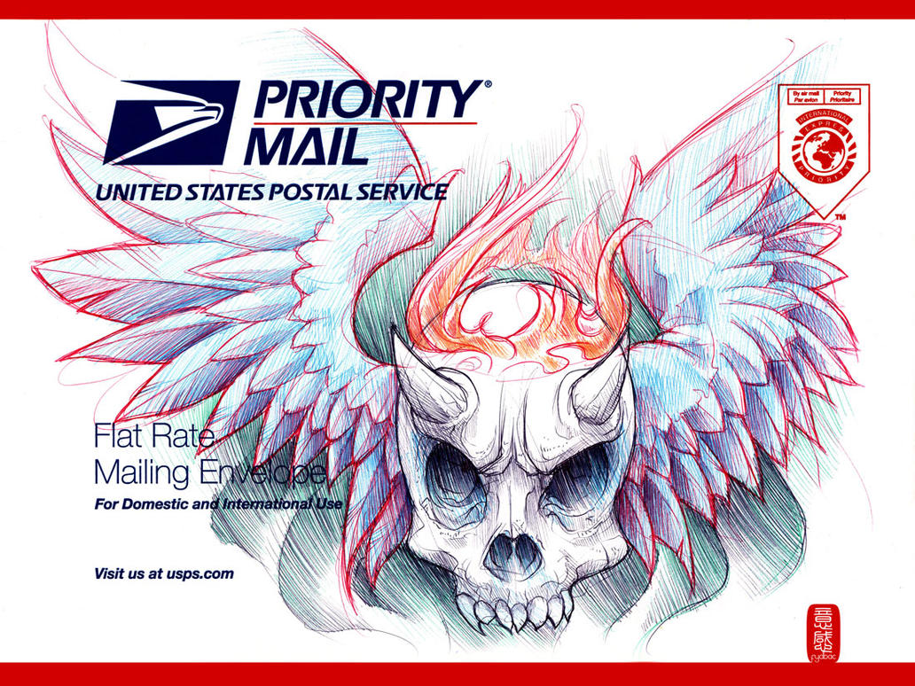
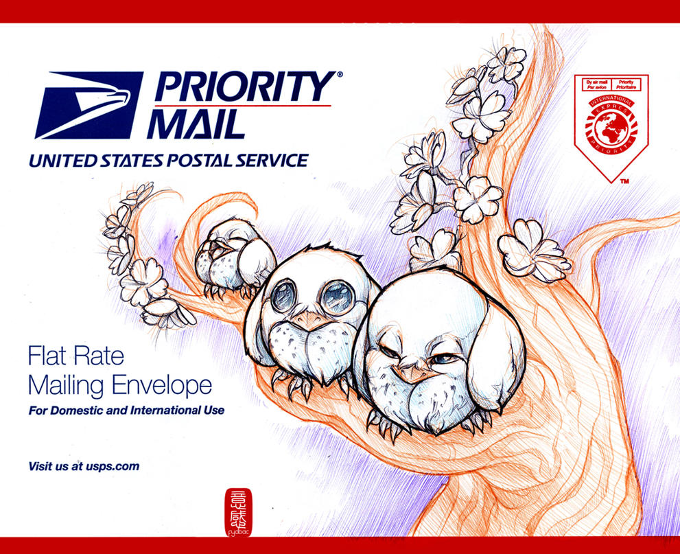
in an age where digital media is speeding everything up, where everything you create can be visible to the world in seconds, its amazing to see someone take a step backwards and take the time to create something that initially is intended to be viewed by a select number of people. ironically though, now you will all see them via the exact engine that is killing the art of letter writing.


each of the images should link through to the artists deviantart profile, if it doesn't here is the link
and here is the link to their portfolio
and here is the link to their blog

on a side note if you think that digital media is taking over the world at an alarming rate and would like to take a look back, you might want to check out a friends site called letters of note, here, its a collection of fascinating letters, postcards, telegrams, faxes and memos. most revealing a different side to celebrities and public figures.

hope you enjoyed this post, maybe you should leave a comment, or even send me a letter.

Labels: , , , , ,

Monday 21 June 2010

jim denevan - sand art


we've all been to the beach and drawn in the sand, but this guy takes that idea to a whole other level.


created using nothing but a stick and pure imagination jim denevan has taken sand art and reinvented it, all his pieces are done free hand using no measuring devices, each piece can take several hours and see him covering distances up to 30 miles.


each if these pieces is truely magnificent, and sand isn't jim's only canvas, he has been known to work on sand, earth and ice and currently (i think) holds the record for the largest piece of art, when he created this piece in nevada, although the elements and vehicle tracks have since covered up the piece.


this is the thing with all jim's artwork, they are all at the mercy of the elements and are all only ever exist for a small amount of time, which makes them all the more special.


jim is also the founder and organizer of a worldwide movable feast call "outstanding in the field" who's mission is to "re-connect diners to the land and the origins of their food, and to honor the local farmers and food artisans who cultivate it."  billed as a restaurant without walls and from the look of these pictures, it looks like a hell of a lot of fun.


jims official website can be found here
outstanding in the field website can be found here
feel free to leave a comment and let me know what you think.
sorry for the delay in posting

Labels: , , , , , ,

Monday 14 June 2010

shopped bilboards

this is pure brilliance, a group of german (i think) street artists, by the names of epoxy, mr talion, baveux & kone, have taken it upon themselves to give a bilboard on the subway a little extra.


at first glance, from a distance there doesnt seem to be that much different with this bilboard than thousands of others round the world, but take a closer look.


these artists have added a photoshop interface to the images, perhaps as a social commentary showcasing the effects that are put onto the glossy celebrity images to make people "beautiful", in an age where so much seems to focus on looks and style, this is a much needed breath of fresh air. i just wish the original image would have been on the history / layers panel so we could see the difference.


along the same lines and done by the same group, are these bilboards, where the interface from the original doom game has been added, as a tribute to id softwares classic game.


as alway click on the images to embiggen
the photoshop flickr set can be found here
the doom flickr set can be found here
if you liked this why not grab the feed

Labels: , , , , , , , , , , , , ,

Monday 7 June 2010

bp gets a makeover

due to the recent small slip up bp have experienced due to a small oil spillage, greenpeace have taken it upon themselves to run a competition to update the green and yellow logo to something more apt.


here are some of the logos that have been submitted, some are actually quite impressive, not that a company would ever want these logos as something representative of their company, but there has been some serious time spent on some of these.


the competition is running in three categories, student/designer, public and finally the under 18s, the response to this competition seems to be incredible with over 500 logos being submitted so far
 
the winning logo is to be used by greenpeace as part of their international campaign against the oil company. so why not head over to the site here or the flickr group here and see what you think, maybe even submit something.

Labels: , , , , , , ,